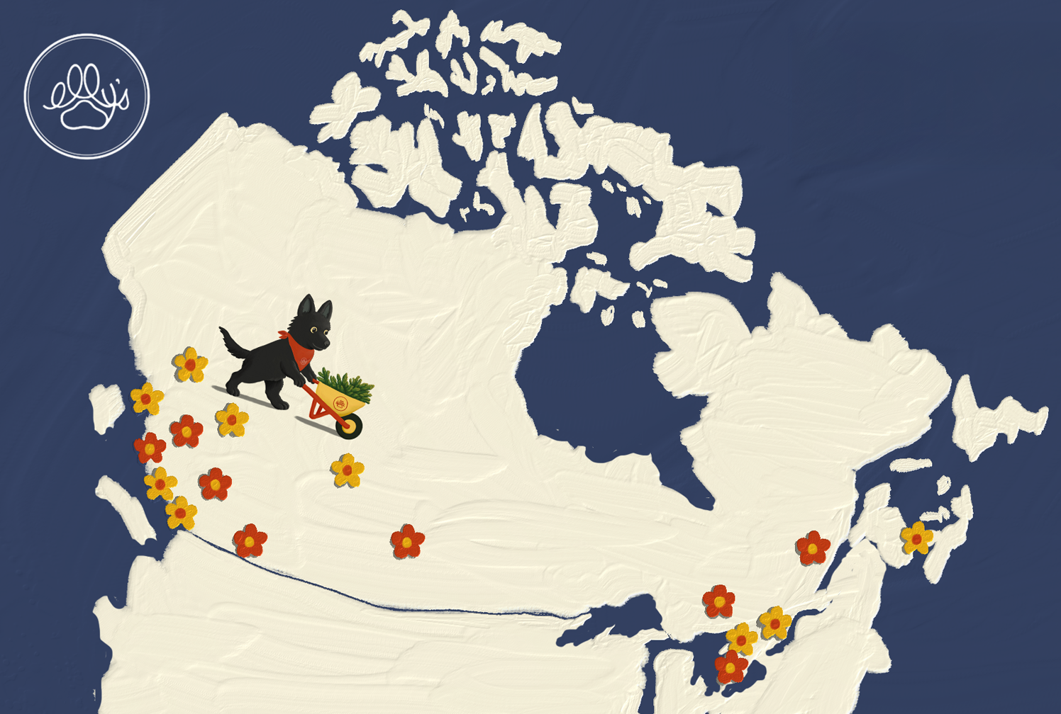
In a crowded cannabis market, Elly's needed a brand identity that could stand out, build trust, and feel memorable without relying on typical cannabis clichés. The brand also needed to communicate its unique model: sourcing top-quality flower from growers across the country.
The name already held the foundation for a stronger story with Elly being the founder's late German Shepherd and harvest dog. Visually I drew inspiration from folk artists like Maud Lewis due to the brand's east coast roots and saw the opportunity to make Elly the face of the brand.


Create a brand world centered around Elly as the traveling harvest dog, following her nose across the country in search of the best flower. Mixing a fashion-inspired sans serif font with playful and homespun illustrations allowed us to feel elevated and grounded all at once.